Geekville was a coworking space for tech & creative pros, a way for innovators to share office space and ideas.
I invented and designed the product from scratch, switching from Logo design to UI design & front-end development, from Wordpress Customization to print design, from copywriting to digital marketing.
Logo Design & identity
Logo, final version
Monogram
Color variations
The logo's core visual feature is the pair of thick, nerdy glasses at the center of the composition, the typical indicator of geek-status.
The typography choice for the logotype is Lavanderia, a script font inspired by vintage window signs.
As for the form-factor, I didn't choose the typical badge or round label but a less frequent — yet still typically vintage — oval.
I tried to keep a certain continuity between Geekville's logo and the The Collective's. That's why Geekville evokes the same vintage feeling, but still being a simpler and less elaborated evolution of its precursor.
Logo, early study
Colors & typography
-
#73afb6
-
#556270
-
#dde0e2
-
#ee6046
-

-

UI Design
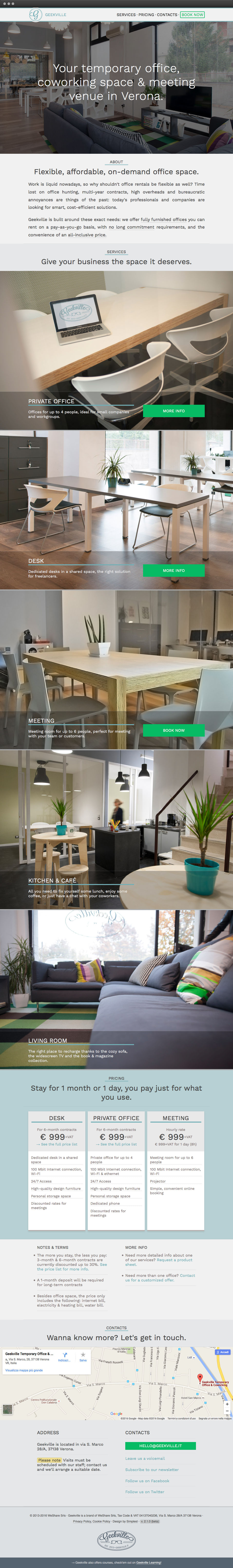
▲ For Version 2 I completely rewrote the website, with 4 goals in mind: (1) implementing a responsive layout; (2) simplifying the overall experience; (3) refreshing the design while preserving the usual look and feel (4) reaching international users by offering an English version. You can check out the website here.
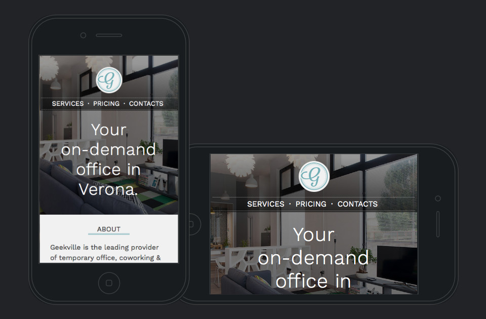
Website, v2 - responsive
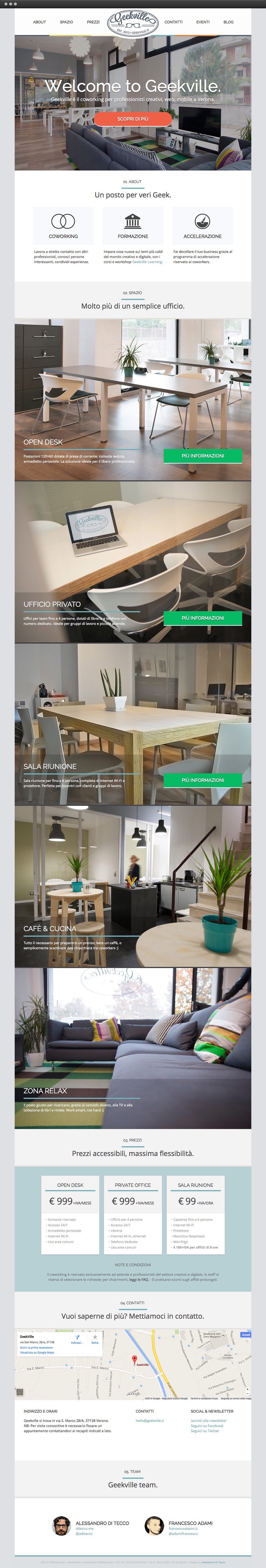
▲ I've alway been a fan of one-page layouts: they're simple, elegant, and they present information in an easily digestible way.
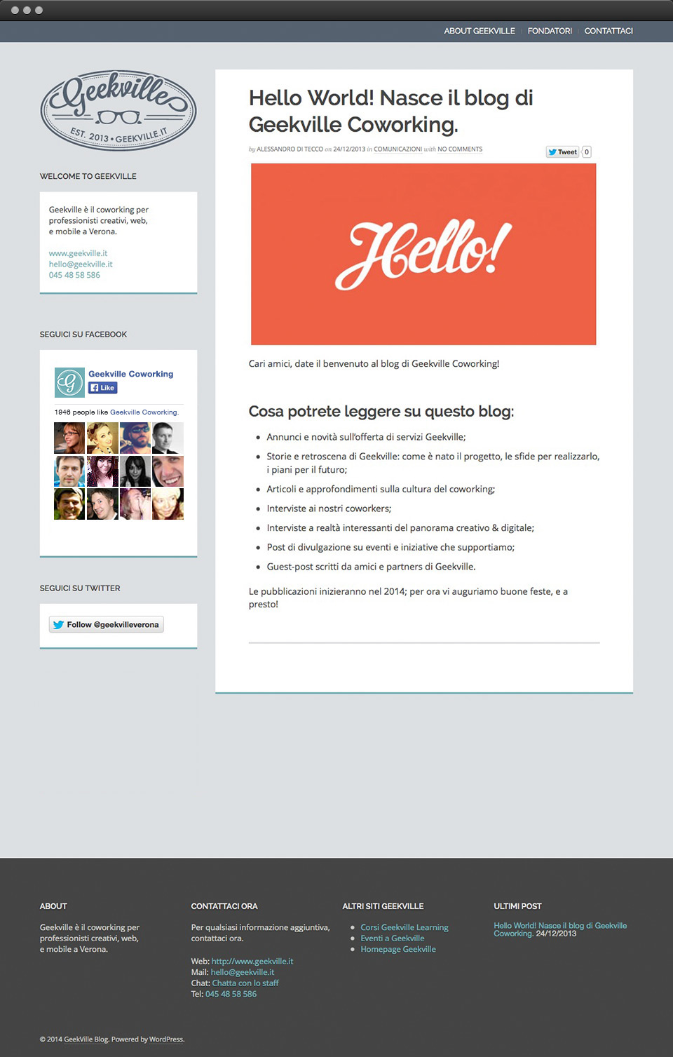
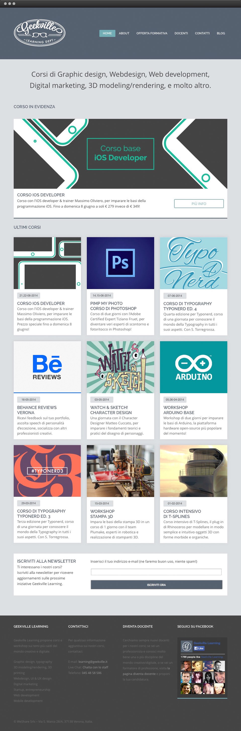
▲ Geekville Learning's website was based on Wordpress, with a customized theme.
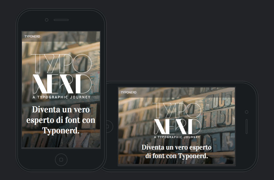
Marketing mini-site, responsive
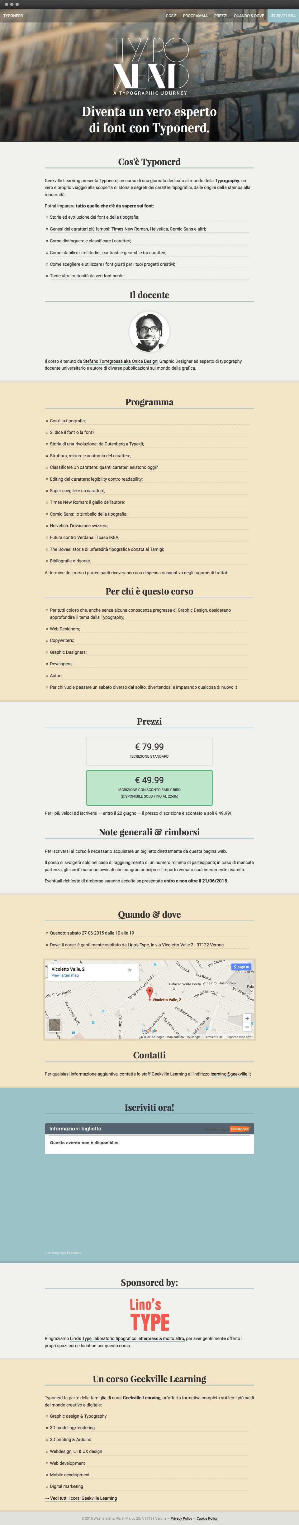
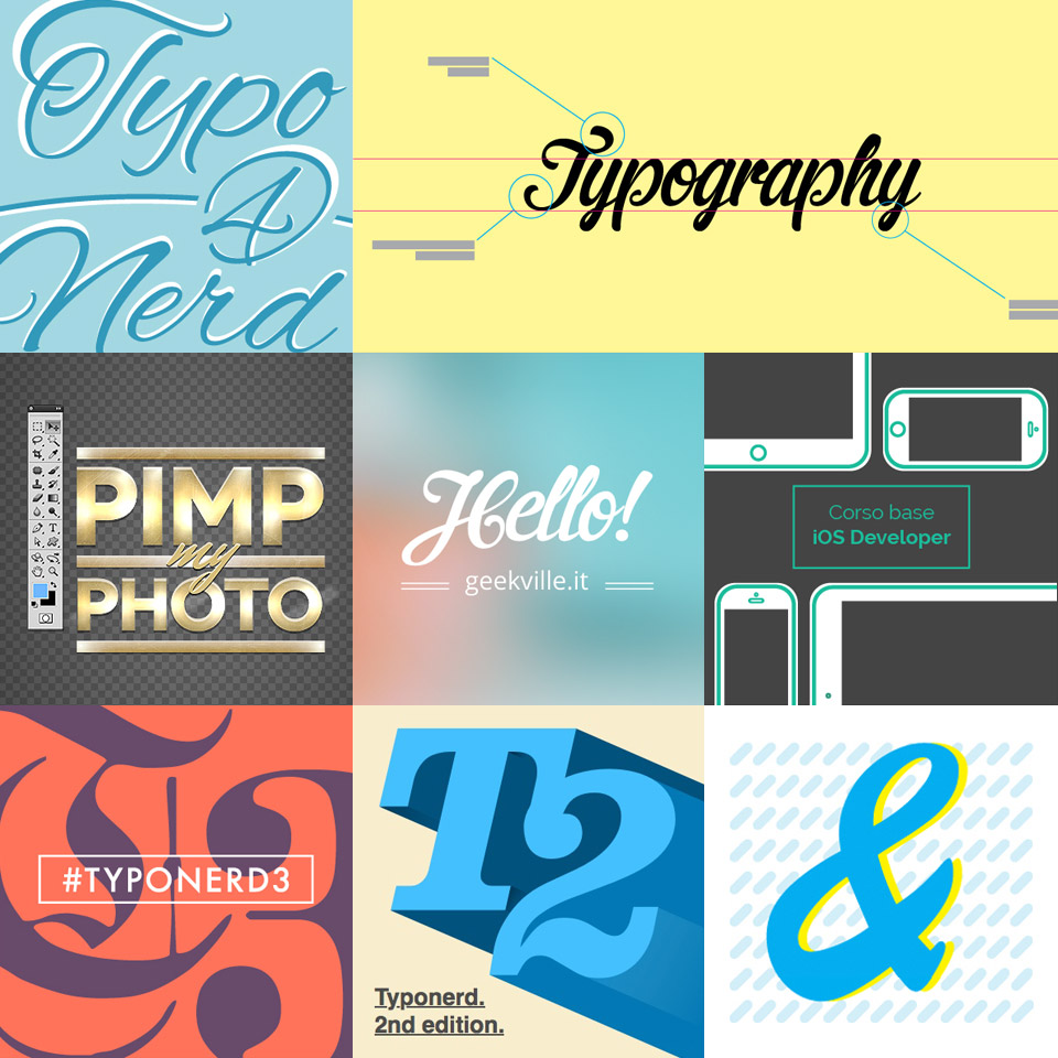
▲ Typonerd was one of Geekville Learning's most successful courses, so we thought it could branch out into its own brand. Graphic Designer Stefano Torregrossa — who also taught the course — created the logo, while I designed & built a dedicated marketing website.
Website Icons
Other visuals
"I invented & designed the product from scratch, often stepping out of my comfort zone"